Viewport
The viewport gives the browser instructions on how to control the page's dimention and scaling.

Responsive Images
Responsive images are images that scale nicely to fit any browser size.
Width
If you set the width of an image to 100% then the image will scale up and down to fit the page. This allows it to scale larger than its original size.
Max-Width
If you set the max-width of an image to 100% then the image will still scale up and down, but it will never be bigger than its original size.
Different Images
The picture element allows you to set different images for different browser window sizes.
Responsive Text
You can set a text size using a vw (viewport window) unit. The text will scale up and down when the browser is resized.
Responsive Layout
To have a responsive layout means that everything on the page is responsive when the page scales up and down and looks good on any size device.
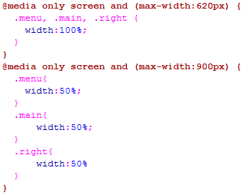
Media Queries
Using Media Queries allows you to create different styles for different browser sizes.
Bootstrap
Bootstrap uses HTML, CSS, and jQuery to make responsive web pages. It is similar to a style sheet and you can use templates with bootstrap, or you can make your own website using bootstrap. For example, on this page I used bootstrap to make a navbar, a jumbotron banner, and responsive divs. I also used bootstrap to center my images.